![]()
Unsupervised Machine Learning#
This tutorial will cover the following content:
Principle component analysis (PCA)
PCA for dimensionality reduction
PCA for compression
k-means clustering
DB Scan
Task – Exploring the ChEMBL small molecule database
Alex Ganose, Imperial College London (2025)
Dimensionality reduction#
Many datasets have a large number of features which can make it slow to train models and difficult to visualize the data. Dimensionality reduction is the process of reducing the number of features in a dataset while retaining as much information as possible. This can help to simplify the data and make it easier to analyse. For example, reducing the number of features can make it easier to visualize the data in two or three dimensions.
Sometimes dimensionality reduction can also help to improve the performance of machine learning models by reducing the risk of overfitting. However, it is important to be careful when using dimensionality reduction, as it can also lead to loss of information and decrease the performance of your model.
The curse of dimensionality
The curse of dimensionality refers to the fact that as the number of features in a dataset increases, the amount of data required to cover the feature space grows exponentially. The table below gives the average distance between two points in a unit hypercube as a function of the number of dimensions.
number of dimensions |
average distance |
|---|---|
2 |
0.52 |
3 |
0.66 |
8 |
1.13 |
100 |
~4.08 |
1,000 |
~12.9 |
1,000,000 |
~408.25 |
As the number of dimensions increases, the average distance between two points in the feature space grows. This means that the data becomes more sparse, and the risk of overfitting increases. Predictions are also much more unreliable, as new instances may be very far away from the training data set, so the model has to extrapolate. As the number of dimensions grows, the amount of data we need to generalise accurately grows exponentially.
Main approaches for dimensionality reduction
There are two main approaches for dimensionality reduction: The first is projecting the data onto a plane in lower dimensional space, called a Projection. The approach is called Manifold Learning.
Both approaches can be visualised through the swiss roll. See the below code for an example. The first plot shows the 3D swiss roll dataset, the second shows a simple projection onto the plane spanning \(x_1\) and \(x_2\) and the third plot shows the 2D manifold space, essentially unrolling the swiss roll.
import matplotlib.pyplot as plt
from sklearn.datasets import make_swiss_roll

X, t = make_swiss_roll(n_samples=1000)

fig = plt.figure(figsize=(12, 4))
ax1 = fig.add_subplot(1, 3, 1, projection='3d')
ax1.scatter(X[:, 0], X[:, 1], X[:, 2], c=t, cmap=plt.cm.viridis)
ax1.view_init(10, -70)
ax1.set(xlabel='$x_1$', ylabel='$x_2$', zlabel='$x_3$')

ax2 = fig.add_subplot(132)
ax2.scatter(X[:, 0], X[:, 1], c=t, cmap=plt.cm.viridis)
ax2.set(xlabel='$x_1$', ylabel='$x_2$')
ax2.grid(True)

ax3 = fig.add_subplot(133)
ax3.scatter(t, X[:, 1], c=t, cmap=plt.cm.viridis)
ax3.set(xlabel='$z_1$', ylabel='$z_2$')
ax3.grid(True)

plt.show()
From this, you can see that projecting the swiss roll onto the \(x_1\)-\(x_2\) plane would not be a good idea, as the data would be all mixed up. However, projecting it onto the \(z_1\)-\(z_2\) plane (i.e., the unfolded plane) would be a good idea, as the data would be linearly separable.
Principle component analysis (PCA)#

PCA is by far the most popular technique for dimensionality reduction. It is a form of projection. It works by finding the directions in which the data varies the most, called the principal components. These directions are the eigenvectors of the covariance matrix of the data. The principal components are ordered by the amount of variance they explain in the data. The first principal component explains the most variance, the second explains the second most, and so on. You can think of PCA as choosing the best hyperplane that minimizes the mean squared distance between the original dataset and its projection onto that plane.
One approach to PCA is through singular value decomposition (SVD). The SVD decomposes the data matrix \(X\) into the dot product of three matrices: \(X = U\Sigma V^T\). The columns of \(U\) are the principal components of \(X\), and the columns of \(V\) are the principal components of \(X^T\). The diagonal elements of \(\sigma\) are the singular values of \(X\).
Here:
\(c_i\) represents the \(i\)-th principal component, all of which are orthogonal to each other.
\(c_1\) is the axis that accounts for the largest amount of variance.
\(c_2\) accounts for the largest amount of the remaining variance, etc…
Important: PCA assumes that your data is centered! In scikit-learn this is taken care of automatically. Furthermore, if your features vary wildly in terms of variance, you should scale your data.
To get a feel for PCA, let’s trial it on a toy dataset.
import numpy as np

num_points = 200

rng = np.random.RandomState(1)
X = np.dot(rng.rand(2, 2), rng.randn(2, num_points)).T

fig, ax = plt.subplots()
ax.scatter(X[:, 0], X[:, 1])
ax.set(xlabel='$x_1$', ylabel='$x_2$')
plt.axis('equal')
plt.show()
It is clear that there is a linear relationship between the x1 and x2 variables. In a regression problem we might be interested in predicting the the y values from the x values. However, in unsupervised learning, we would like to learn about the relationship between the x and y values.
We can apply principal component analysis by using scikit-learns PCA class.
from sklearn.decomposition import PCA

pca = PCA(n_components=2)
pca.fit(  )
Code hint
As with all scikit-learn estimators, you'll need to pass the feature matrixX to the fit function.
The fit learns some information from the data, in particular, the “components” and the “explained variance”. For example, to see the components:
pca.components_
Or to see the explained variance:
pca.explained_variance_
Here, we have asked for two principal components, hence we have two sets of information for each property.
Let’s try and understand what these numbers mean by visualising them as vectors over the input data. The components define the direction of the vectors while the explained variance defines the squared length of the vector.
fig, ax = plt.subplots()
ax.scatter(X[:, 0], X[:, 1])
ax.set(xlabel='$x_1$', ylabel='$x_2$', xlim=(-1, 1), ylim=(-2, 2))

for length, vector in zip(pca.explained_variance_, pca.components_):
    v = vector * 3 * np.sqrt(length)
    ax.annotate(
        "",
        pca.mean_ + v,
        pca.mean_,
        arrowprops=dict(arrowstyle='->', color="red", linewidth=2, shrinkA=0, shrinkB=0),
    )

plt.axis('equal')
plt.show()
These vectors are the principal components of the data. The length is an indication of how “important” the axis is in capturing the variance of the data in that axis.
PCA for dimensionality reduction
We can use PCA for dimensionality reduction by removing one or more of the smallest principal components. This creates a lower-dimensional projection of the data that preserves the maximum variance of the data.
We can do this by reducing the number of components.
pca = PCA(n_components=1)
pca.fit(X)
This has identified the best principal component. We can now transform data by projecting it onto this component:
X_pca = pca.transform( )
Code hint
Similar to the fit funciton, you'll need to pass the feature matrixX to the transform function.
Lets look at the shape of our data to understand the transformation:
print("original shape:   ", X.shape)
print("transformed shape:", X_pca.shape)
The transformed data has been reduced to a single dimension. To understand the effect of this dimensionality reduction, we can perform the inverse transform of this reduced data and plot it along with the original data:
X_new = pca.inverse_transform(X_pca)

fig, ax = plt.subplots()
ax.scatter(X[:, 0], X[:, 1], label="original")
ax.scatter(X_new[:, 0], X_new[:, 1], label="decoded")
ax.set(xlabel='$x_1$', ylabel='$x_2$', xlim=(-1, 1), ylim=(-2, 2))
ax.legend()
plt.axis('equal')
plt.show()
The blue points are the original data, while the orange are the projected version. Clearly some information about the data has been lost. Specifically, we can no longer describe the variance along the second principal component.
The amount of variance lost is represented the the explained_variance_ attribute we discussed above.
In this case, we have reduced the dimensionality by 50%. The hope is that the other benefits this provides is enough to outweight the downsides of this loss.
PCA for noise reduction
PCA can be used as a filtering approach for noisy data. The idea is that any components much larger than the effect of the noise should be unaffected by the noise. So if we reconstruct the data using largest principal components we should keep the main signal and throw away the noise.
We can see how this works by using the digits data from scikit learn. This dataset consists of 8x8 pixel images of digits from 0 to 9. First, let’s plot some of the noise-free data.
from sklearn.datasets import load_digits

digits = load_digits().data
print(digits.shape)
There are 1797 digit images each with 64 (8x8) features (pixels). Lets plot the data
def plot_digits(data):
    fig, axes = plt.subplots(4, 10, figsize=(10, 4))
    for i, ax in enumerate(axes.flat):
        ax.imshow(data[i].reshape(8, 8), cmap='binary', interpolation='nearest', clim=(0, 16))
        ax.axis('off')
    plt.show()

plot_digits(digits)
Now we can add some noise and replot it.
noisy = np.random.normal(digits, 4)
plot_digits(noisy)
The digits are now noisy and more difficult to make out. Let’s fit a PCA on the noisy data. This time, rather than picking the number of components in advance, we will specify that the projection preseves at least 50% of the variance.
pca = PCA(0.50).fit(  )
pca.n_components_
Code hint
We want to fit our model on the noisy data. You can do this with:pca = PCA(0.50).fit(noisy)
We have reduced from 64 dimensions to 12 dimensions. We can now use this fitting to project the noisy data onto the reduced space and then transform it back to the original dataset dimensions. This process will loose some of the variance, as shown with the linear data example.
components = pca.transform(noisy)
filtered = pca.inverse_transform(components)
plot_digits(filtered)
We have managed to filter out the noise, albeit at the loss of some clarity of the images. This filtering property can be very useful when training supervised models on noisy data.
As a final demonstration, we will fit the PCA on the digits dataset again, and this time keep the full 64 dimensions. This will enable us to explore the propotion of variance explained and reveal why 12 components was selected previously.
pca = PCA(n_components=64).fit(noisy)

fig, (ax1, ax2) = plt.subplots(2, 1, sharex=True, figsize=(6, 6))
ax1.plot(pca.explained_variance_ratio_ * 100)
ax2.plot(np.cumsum(pca.explained_variance_ratio_) * 100)
ax1.set(ylabel='Explained variance (%)')
ax2.set(ylabel='Cumulative explained variance', xlabel='Num components')
ax2.axhline(50, ls=":", c="grey")
ax2.axvline(12, ls=":", c="grey")
plt.subplots_adjust(hspace=0.05)
plt.show()
Challenge 1#
We will use the scikit learn wine dataset for this challenge. The dataset contains 13 features of 178 wine samples. The target is a class from 0, 1, or 2. You should fit a PCA to this dataset and try to answer:
How much of the variance is explained by the first two components?
How many components are needed to explain 95% of the variance?
Optional: plot the first two components against each other as a scatter plot and label the points with the target class.
Please note, as the features vary widly in terms of variance, you need to scale your data before performing the PCA:
from sklearn.preprocessing import StandardScaler
X_scaled = StandardScaler().fit_transform(X)
We can see a summary of the dataset using:
from sklearn.datasets import load_wine

data = load_wine()
print(data.DESCR)
We can check the shape of the data:
X = data.data
y = data.target
print(X.shape)
# 3, 2, 1, code!
Answer
We can extract this information using the following code:from sklearn.preprocessing import StandardScaler
X_scaled = StandardScaler().fit_transform(X)
pca = PCA(n_components=13)
pca.fit(X_scaled)
print(f"2-component explained variance: {pca.explained_variance_ratio_[:2].sum() * 100:.3f}%")
print(f"95% explained variance: {np.argmax(np.cumsum(pca.explained_variance_ratio_) >= 0.95) + 1} components")
X_pca = pca.transform(X_scaled)
fig, ax = plt.subplots()
for i in range(3):
mask = y == i
ax.scatter(X_pca[mask, 0], X_pca[mask, 1], label=data.target_names[i])
ax.set(xlabel='1st component', ylabel='2nd component')
ax.legend()
plt.show()
Non-linear dimensionality reduction
PCA is part of the family of Projections. The methods below are Manifold Learning algorithms. For more information, see here: https://scikit-learn.org/stable/modules/manifold.html.
Locally Linear Embedding (LLE)
Multidimensional Scaling (MDS)
Isomap
t-Distributed Stochastic Neighbor Embedding (t-SNE)
Care: The code below may take some time to run!
from sklearn.manifold import TSNE, Isomap, MDS, LocallyLinearEmbedding

X, t = make_swiss_roll(n_samples = 1000, noise = 0.2)

methods = [
    LocallyLinearEmbedding(n_components=2, n_neighbors=10),
    MDS(n_components=2),
    Isomap(n_components=2),
    TSNE(n_components=2)
]

fig, axes = plt.subplots(1, 4, figsize = (15, 4))

for ax, method in zip(axes, methods):
    X_reduced = method.fit_transform(X)
    ax.set(xlabel='$z_1$', ylabel='$z_2$', title=method.__class__.__name__)
    ax.scatter(X_reduced[:, 0], X_reduced[:, 1], c=t, cmap=plt.cm.viridis)
    ax.grid(True)

plt.show()
Clustering#
Clustering is a type of unsupervised learning that groups similar objects into clusters. The goal is to partition data into groups such that points in the same group are more similar to each other than to points in other groups. Clustering is a form of exploratory data analysis that can reveal hidden patterns in data. It is the unsupervised learning counterpart of classification. There is no universal definition of what a cluster is, and different clustering algorithms use different definitions.
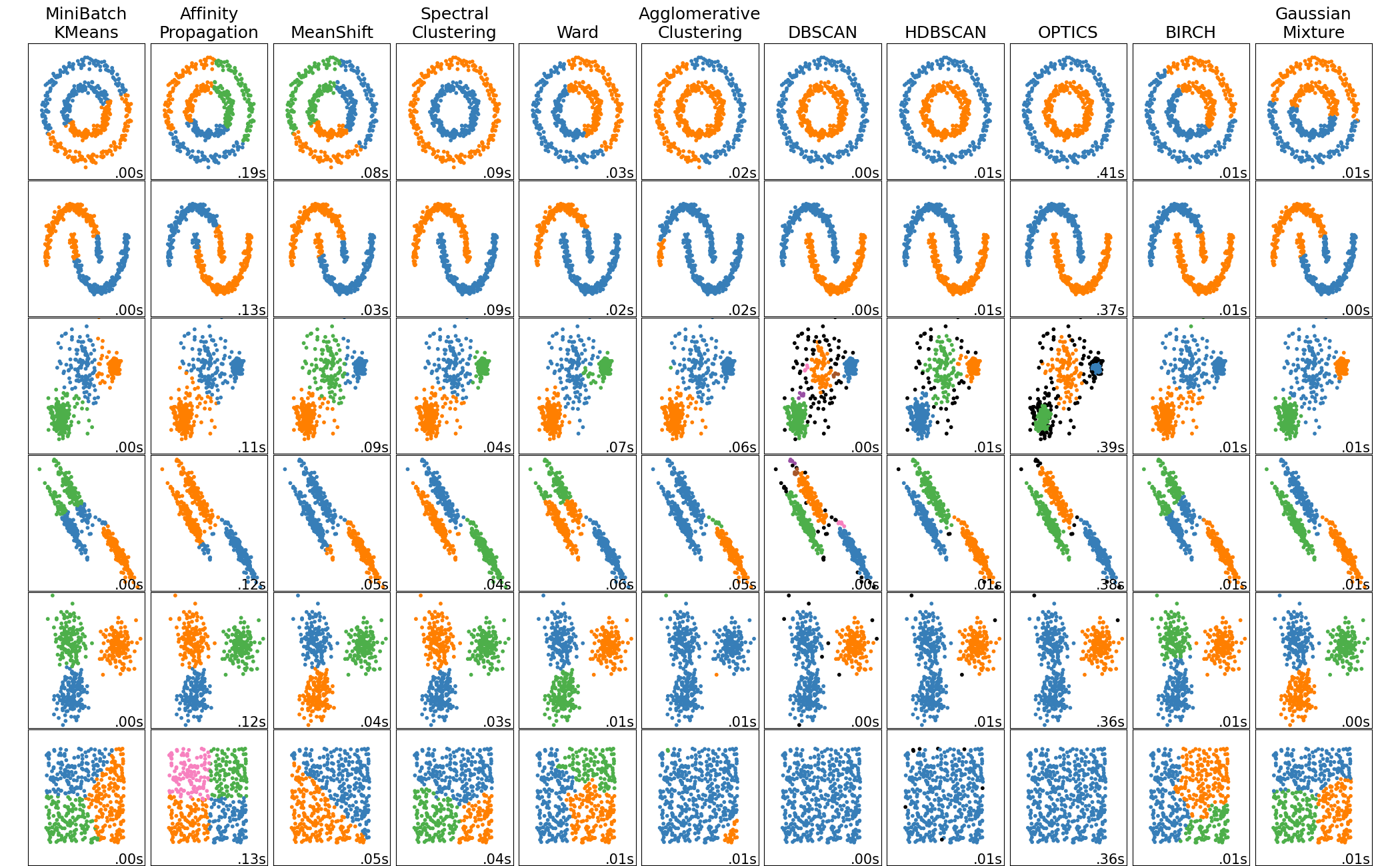
The most common clustering algorithms are:
KMeans
DBSCAN
Agglomerative (hierarchical) clustering
Gaussian Mixture Models
k-means clustering
k-Means is the most popular clustering algorithm. It is simple, fast, and works well in practice. The algorithm works as follows:
Initialize the cluster centers randomly.
Assign each point to the nearest cluster center.
Update the cluster centers to the mean of the points assigned to the cluster.
The algorithm converges when the cluster centers do not change significantly between iterations. The number of clusters must be specified in advance. The algorithm is sensitive to the initialization of the cluster centers. It is common to run the algorithm multiple times with different initializations and choose the best result.
We will demonstrate k-means clustering on some synthetic data.
from sklearn.datasets import make_blobs

X, y = make_blobs(n_samples=300, centers=4, cluster_std=0.9, random_state=0)

fig, ax = plt.subplots()
ax.scatter(X[:, 0], X[:, 1], s=50)
ax.set(xlabel='$x_1$', ylabel='$x_2$')
plt.show()
We can use the KMeans class in scikit learn to perform the clustering.
In this case, we know there are 4 clusters in this case (set by the centers parameter in make_blobs) so we will use this to make the clustering easier. In practical circumstances, this value will not be known.
from sklearn.cluster import KMeans

kmeans = KMeans(n_clusters=4)
kmeans.fit(X)
We can get the value of the predicted clusters using the predict function.
y_pred = kmeans.predict(X)
y_pred
And the centroids of the 4 clusters are also available:
centres = kmeans.cluster_centers_
centres
Now lets plot the predicted clusters:
fig, ax = plt.subplots()
ax.scatter(X[:, 0], X[:, 1], c=y_pred, s=50, cmap='viridis')
ax.scatter(centres[:, 0], centres[:, 1], marker="x", c='red', s=200)
ax.set(xlabel='$x_1$', ylabel='$x_2$', title='KMeans labels')
plt.show()
We can see how this compares to the true labels. Note, the cluster labels are arbitrary and do not necessarily correspond to the true labels, so you can ignore the specific colours and instead focus on the groupings.
fig, ax = plt.subplots()
ax.scatter(X[:, 0], X[:, 1], c=y, s=50, cmap='viridis')
ax.set(xlabel='$x_1$', ylabel='$x_2$', title="True Labels")
plt.show()
We can plot the decision boundaries using the DecisionBoundaryDisplay class. For k-means clustering, this always corresponds to a Voronoi diagram.

from sklearn.inspection import DecisionBoundaryDisplay

fig, ax = plt.subplots()
display = DecisionBoundaryDisplay.from_estimator(
    kmeans,
    X,
    alpha=0.3,
    plot_method="pcolormesh",
    ax=ax,
    response_method="predict",
    xlabel="$x_1$",
    ylabel="x_2",
    grid_resolution=250
)
scatter = ax.scatter(*X.T, c=y_pred, edgecolor="k")
ax.legend(*scatter.legend_elements(), title="Classes")
ax.scatter(centres[:, 0], centres[:, 1], marker="x", c='red', s=200)
plt.show()
Subsampling from clusters#
In the context of materials science, often you may want to sample from your clusters to reduce the dataset size while maintaining diversity. One example might be when creating a dataset of structures to use when training a machine learning interatomic potential. You may cluster the structures based on their atomic descriptors and sample to reduce the overall dataset size for training.
To sample from your clusters a number of strategies can be employed.
Method |
How It Selects Points |
Use Case |
|---|---|---|
Random Subsampling |
Selects points randomly from each cluster |
General dataset size reduction |
Centroid Proximity |
Chooses points closest to the cluster center |
Retains the most representative samples |
Density-Based Sampling |
Prefers points in high-density areas within each cluster |
Ensures more data from denser clusters |
Diversity Sampling |
Selects points spread across the cluster |
Preserves variation within each cluster |
Stratified Sampling |
Ensures equal or weighted selection across clusters |
Maintains balanced representation |
Below is an example of uniform subsampling from each cluster after k-means clustering:
def subsample_clusters(X, labels, sample_fraction=0.2):
    """
    Subsamples data points from each cluster to reduce dataset size.

    Parameters:
    - X: numpy array, shape (n_samples, n_features), the dataset
    - labels: numpy array, shape (n_samples,), cluster labels for each point
    - sample_fraction: float, fraction of points to keep per cluster
    - random_state: int, seed for reproducibility

    Returns:
    - X_sub: numpy array, the subsampled dataset
    - y_sub: numpy array, the corresponding cluster labels
    """
    subsampled_indices = []

    for cluster in np.unique(labels):
        cluster_indices = np.where(labels == cluster)[0]  # get indices of points in this cluster
        sample_size = max(1, int(sample_fraction * len(cluster_indices)))  # ensure at least one sample
        selected_indices = np.random.choice(cluster_indices, size=sample_size, replace=False)  # randomly sample
        subsampled_indices.extend(selected_indices)  # add to the list

    subsampled_indices = np.array(subsampled_indices)
    return X[subsampled_indices], labels[subsampled_indices]

X_sub, y_sub = subsample_clusters(X, y_pred, sample_fraction=0.2)

print(f"Original dataset size: {X.shape[0]}")
print(f"Subsampled dataset size: {X_sub.shape[0]}")
We can plot the subsampled points.
fig, ax = plt.subplots()
ax.scatter(X[:, 0], X[:, 1], c="grey", alpha=0.3, s=50, cmap='viridis')
ax.scatter(X_sub[:, 0], X_sub[:, 1], c=y_sub, s=50, cmap='viridis')
ax.scatter(centres[:, 0], centres[:, 1], marker="x", c='red', s=200)
ax.set(xlabel='$x_1$', ylabel='$x_2$', title='KMeans labels')
plt.show()
We can also subsample based on centroid proximity.
This works via the following steps:
Identify cluster points → Find all data points belonging to a cluster.
Compute distances to centroid → Measure how far each point is from the cluster center.
Sort points by proximity → Sort points in ascending order of their distance to the centroid.
Select closest points → Retain the top sample_fraction fraction of points.
Return the reduced dataset → The selected points become our representative subsample.
def subsample_by_centroid_proximity(X, labels, centroids, sample_fraction=0.2):
    """
    Subsamples points closest to the cluster centroids.

    Parameters:
    - X: numpy array, shape (n_samples, n_features), the dataset
    - labels: numpy array, shape (n_samples,), cluster labels
    - centroids: numpy array, shape (n_clusters, n_features), cluster centers
    - sample_fraction: float, fraction of points to retain per cluster

    Returns:
    - X_sub: numpy array, subsampled dataset
    - y_sub: numpy array, corresponding cluster labels
    """
    subsampled_indices = []

    for cluster in np.unique(labels):
        # get indices of points in this cluster
        cluster_indices = np.where(labels == cluster)[0]
        cluster_points = X[cluster_indices]

        # find closter centre index
        centre = np.linalg.norm(cluster_points[:, None] - centroids[None, :], axis=2).mean(axis=0).argmin()

        # compute distances from points to cluster centroid
        distances = np.linalg.norm(cluster_points - centroids[centre], axis=1)

        # determine how many points to keep
        sample_size = max(1, int(sample_fraction * len(cluster_indices)))

        # select the closest points to the centroid
        closest_indices = cluster_indices[np.argsort(distances)[:sample_size]]
        subsampled_indices.extend(closest_indices)

    subsampled_indices = np.array(subsampled_indices)
    return X[subsampled_indices], labels[subsampled_indices]

X_sub_centroid, y_sub_centroid = subsample_by_centroid_proximity(X, y_pred, centres, sample_fraction=0.2)

print(f"Original dataset size: {X.shape[0]}")
print(f"Subsampled dataset size (centroid-based): {X_sub_centroid.shape[0]}")

fig, ax = plt.subplots()
ax.scatter(X[:, 0], X[:, 1], c="grey", alpha=0.3, s=50, cmap='viridis')
ax.scatter(X_sub_centroid[:, 0], X_sub_centroid[:, 1], c=y_sub_centroid, s=50, cmap='viridis')
ax.scatter(centres[:, 0], centres[:, 1], marker="x", c='red', s=200)
ax.set(xlabel='$x_1$', ylabel='$x_2$', title='KMeans labels')
plt.show()
k-Means++
The KMeans class applies an optimized algorithm by default. To get the original K-Means algorithm (for educational purposes only), you must set init="random", n_init=1and algorithm="lloyd". These hyperparameters will be explained below.
Instead of initializing the centroids entirely randomly, it is preferable to initialize them using the following algorithm, proposed in a 2006 paper by David Arthur and Sergei Vassilvitskii:
Take one centroid \(c_1\), chosen uniformly at random from the dataset.
Take a new center \(c_i\), choosing an instance \(\mathbf{x}_i\) with probability: \(D(\mathbf{x}_i)^2\) / \(\sum\limits_{j=1}^{m}{D(\mathbf{x}_j)}^2\) where \(D(\mathbf{x}_i)\) is the distance between the instance \(\mathbf{x}_i\) and the closest centroid that was already chosen. This probability distribution ensures that instances that are further away from already chosen centroids are much more likely be selected as centroids.
Repeat the previous step until all \(k\) centroids have been chosen.
The rest of the K-Means++ algorithm is just regular K-Means. With this initialization, the K-Means algorithm is much less likely to converge to a suboptimal solution, so it is possible to reduce n_init considerably (the number of repetitions of the algorithm). Most of the time, this largely compensates for the additional complexity of the initialization process.
To set the initialization to K-Means++, simply set init="k-means++" (this is actually the default). We can check how the two compare below:
kmeans_naive = KMeans(n_clusters=4, n_init=1, init="random", algorithm="lloyd")
kmeans_naive.fit(X)
y_pred_naive = kmeans_naive.predict(X)

fig, (ax1, ax2) = plt.subplots(1, 2, figsize=(8, 4))
ax1.scatter(X[:, 0], X[:, 1], c=y_pred_naive, s=50, cmap='viridis')
ax2.scatter(X[:, 0], X[:, 1], c=y_pred, s=50, cmap='viridis')
ax1.set(xlabel='$x_1$', ylabel='$x_2$', title='KMeans random init')
ax2.set(xlabel='$x_1$', ylabel='$x_2$', title='KMeans k-means++ init')
plt.show()
Challenge 2#
In most applications, the number of clusters is not known a priori. One way to determine the optimal number of clusters is to use the elbow method. The idea is to plot the sum of squared distances from each point to the closest cluster center as a function of the number of clusters. The point at which the curve starts to flatten is the optimal number of clusters.
The inertia_ attribute of the KMeans object gives the sum of squared distances from each point to the closest cluster center and is therefore a measure of the quality of the clustering.
The lower the inertia, the better the clustering.
For example, on our k=4 model, we can check the performance using:
kmeans.inertia_
Your challenge is to use this attribute to assess the optimal number of clusters. You should:
Perform k-means clustering for the number of clusters from 1 to 10.
Plot the inertia vs the number of clusters.
Identify the optimal value according to the elbow.
# 3, 2, 1, code!
Answer
We can complete this challenge using the following code:inertia = []
for n_clusters in range(1, 10):
kmeans = KMeans(n_clusters=n_clusters)
kmeans.fit(X)
inertia.append(kmeans.inertia_)
fig, ax = plt.subplots()
ax.plot(range(1, 10), inertia, marker='o')
ax.set(xlabel='Number of clusters', ylabel='Inertia')
plt.show()
The correct number of clusters in this case is 4, so the method has worked well here.
Limitations of k-means clustering
Despite its strengths, k-means clustering has several limitations. Firstly, the number of clusters must be specified in advance. Furthermore, the algorithm is sensitive to:
Outliers
The scale of the data
The shape of the clusters
The density of the clusters
We can demonstrate these limitations using the following example:
from sklearn.datasets import make_moons

X, y = make_moons(n_samples=200, noise=0.05, random_state=0)

fig, ax = plt.subplots()
ax.scatter(X[:, 0], X[:, 1], c=y, s=50, cmap='viridis')
ax.set(xlabel='$x_1$', ylabel='$x_2$')
plt.show()
Here, the data is not spherically distributed. Lets see what happens when we trial kmeans clustering:
kmeans = KMeans(n_clusters=2)
kmeans.fit(X)
y_pred = kmeans.predict(X)

fig, ax = plt.subplots()
ax.scatter(X[:, 0], X[:, 1], c=y_pred, s=50, cmap='viridis')
ax.set(xlabel='$x_1$', ylabel='$x_2$', title='KMeans labels')
plt.show()
In this example, the clusters are not well-separated, and the k-means algorithm struggles to identify the two moon-shaped clusters.
DBSCAN#
We can address this issue by using a different clustering algorithm, such as DBSCAN (Density-Based Spatial Clustering of Applications with Noise). DBSCAN is a density-based clustering algorithm that groups together points that are closely packed. It does not require the number of clusters to be specified in advance, and it can identify clusters of arbitrary shapes.
DBSCAN works by the following algorithm:
For each point, it counts the number of points within a given distance \(\varepsilon\) (eps) of the point.
If a point has at least
min_samplespoints within \(\varepsilon\) distance (equal to 3 in the picture), it is considered a core point.A cluster is formed by grouping together core points that are reachable (within eps distance) of each other.
Points that are not core points and are not within eps distance of any core points are considered noise points.

For example, in the image, all red points near A are core points. Points B and C are not core points themselves, but are reachable from some core points in A, and thus also belong to that cluster. Point N is neither a core instance, nor reachable from any core instance and hence it is labelled as noise.
Let’s apply DBSCAN to the moon dataset:
from sklearn.cluster import DBSCAN

dbscan = DBSCAN(eps=0.2, min_samples=5)
y_pred = dbscan.fit_predict(X)
In the code above, we set the eps parameter to 0.2 and the min_samples parameter to 5. The eps parameter controls the maximum distance between two samples for one to be considered as in the neighborhood of the other. The min_samples parameter specifies the number of samples in a neighborhood for a point to be considered as a core point.
We also use the shortcut of calling fit_predict to get the predicted labels, which is equivalent to first calling fit followed by predict.
fig, ax = plt.subplots()
ax.scatter(X[:, 0], X[:, 1], c=y_pred, s=50, cmap='viridis')
ax.set(xlabel='$x_1$', ylabel='$x_2$', title='DBSCAN labels')
plt.show()
Perhaps surprisingly, DBSCAN does not have a predict() method. Instead, we have to train a classification algorithm to do that given the components of the model. If we do this, we can plot the decision boundary.
from sklearn.inspection import DecisionBoundaryDisplay
from sklearn.svm import SVC

svm = SVC(kernel='rbf', gamma='scale', probability=True)
svm.fit(dbscan.components_, dbscan.labels_[dbscan.core_sample_indices_])

fig, ax = plt.subplots()
display = DecisionBoundaryDisplay.from_estimator(
    svm,
    X,
    alpha=0.3,
    plot_method="pcolormesh",
    response_method="predict",
    ax=ax,
    xlabel="$x_1$",
    ylabel="$x_2$",
    grid_resolution=500
)
scatter = ax.scatter(*X.T, c=y_pred, edgecolor="k")
ax.legend(*scatter.legend_elements(), title="Classes")
plt.show()
Challenge 3#
You should apply DBSCAN to the iris dataset to see how it performs on more complex data.
Fit the model on the iris dataset and predict the target classes.
How many classes does DBSCAN predict? Does this match the original dataset?
Plot the last two features of the data (petal length and petal width) and indicate the predicted labels.
Perform a comparable plot using the actual labels. Do they agree?
Optional: Do the same analysis with Kmeans clustering. Which does better?
The iris dataset contains 150 samples of iris flowers, each with four features. The target variable is the species of iris, which can be one of three possible values: setosa, versicolor, or virginica (given as integers 0, 1, and 2, respectively).


from sklearn.datasets import load_iris

data = load_iris()
X = data.data
y = data.target
# 3, 2, 1, code!
Answer
We can complete this challenge using the following code:dbscan = DBSCAN()
kmeans = KMeans(n_clusters=3)
y_pred_dbscan = dbscan.fit_predict(X)
y_pred_kmeans = kmeans.fit_predict(X)
fig, (ax1, ax2, ax3) = plt.subplots(1, 3, figsize=(12, 4))
ax1.scatter(X[:, 2], X[:, 3], c=y, s=50, cmap='viridis')
ax2.scatter(X[:, 2], X[:, 3], c=y_pred_dbscan, s=50, cmap='viridis')
ax3.scatter(X[:, 2], X[:, 3], c=y_pred_kmeans, s=50, cmap='viridis')
ax1.set(xlabel=data.feature_names[2], ylabel=data.feature_names[3], title='True labels')
ax2.set(xlabel=data.feature_names[2], ylabel=data.feature_names[3], title='DBSCAN labels')
ax3.set(xlabel=data.feature_names[2], ylabel=data.feature_names[3], title='Kmeans labels')
plt.show()
It appears that K-means does better in this case!
Task: Explore the ChEMBL dataset#
For the final excerise we will have a look at the data contained in the ChEMBL database. ChEMBL (or ChEMBLdb) is a manually curated chemical database of bioactive molecules with drug-like properties. It is maintained by the European Bioinformatics Institute (EBI), of the European Molecular Biology Laboratory (EMBL), based at the Wellcome Trust Genome Campus, Hinxton, UK.
Firstly, take some time to familiarise yourself with the database. To browse all compounds available, click here.
We have already prepared a CSV file of all compounds with a molecular weight less than 200. This should keep the dataset reasonably small to do some exploratory analysis.
This challenge is completely open-ended (as with most data exploration). Play around with the data and see which variables make sense to focus on (all numeric variables or just some?).
Try using dimensionality reduction to make the data more accessible to various models.
What happens when you cluster the data? Can you find any trends in the clusters?
There is no correct answer here, but some are better than others.
Credit: Inspiration for this challenge was taken from here.
import pandas as pd

df = pd.read_csv("https://raw.githubusercontent.com/utf/DataAnalyticsChemistry/refs/heads/main/datasets/chembl-small.csv")
df
# Your code here
Additional reading#
This notebook can be complimented with Chapter 12 of Introduction to Statistical Learning for more background to unsupervised learning.